- Redesigns
- Oat & Ember
- Available for acquisition
- E-commerce
- Original concept
Oat & Ember
A small-batch ceramics shop that sells like a magazine and checks out like a utility.
- Industry
- Handmade ceramics
- Type
- Online store
- Year
- 2026
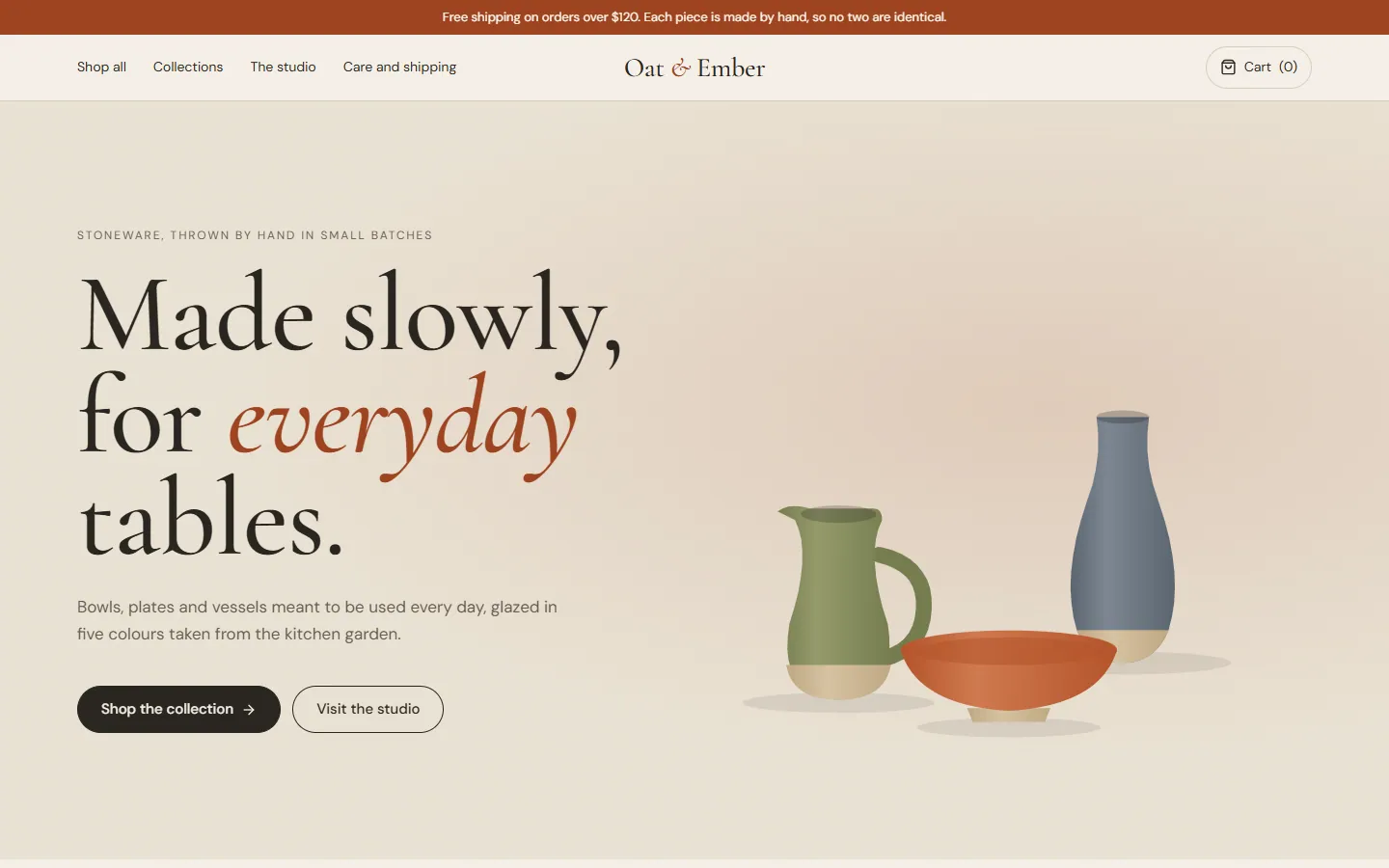
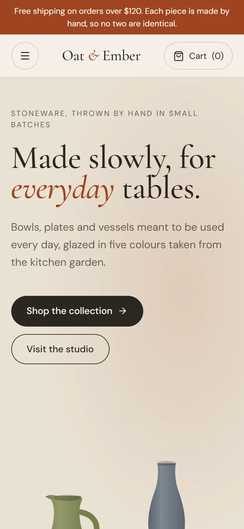
The concept
Independent makers often run on a stock store theme that makes a hand-thrown bowl look like a warehouse listing. Oat & Ember is a concept for a studio shop with the warmth of print, a serif voice, generous space and objects drawn as the hero, while keeping the mechanics of buying fast and familiar.
Four pages are coded and connected: the homepage, a filterable collection, a product page and a cart with a three-step checkout. The cart persists between pages for the visit. Checkout is a prototype and places no order.
Oat & Ember is a fictional brand created for this concept. Any product details shown are illustrative.
Pages
4 pages, every device.
Switch pages and devices. Interactive previews are the working prototype; screenshots are marked as such.
Interactive prototype: a working, coded build of the concept
Homepage
An editorial opening, the three collections, the studio story and a row of pieces you can add straight to the cart.
Journeys
Shopping flow
From browsing to a filled cart
Every step is a working page in the prototype.
Enter by collection
Homepage tiles open the collection with that filter already applied.
Try it in the prototypeNarrow the shelf
Glaze swatches, price bands and an in-stock toggle combine; the count updates live.
Try it in the prototypeChoose the glaze
The product page swaps the piece's colour with the variant and keeps the price in view.
Try it in the prototypeCheck out in three steps
Information, shipping and payment, with the order summary beside every step.
Try it in the prototype
Mobile
Designed for the phone, not shrunk to it.
Each page at 390px wide. Select one to see it full length.
Homepage Collection Product detail Cart and checkout
Design rationale
Why it looks and works this way.
Objects first
Each piece is the largest thing on its card. Typography is warm and quiet so the glaze carries the colour.
Editorial outside, utility inside
The homepage reads like a magazine spread. The collection and cart drop the flourish and behave like the stores people already know.
Filters that never dead-end
Counts update as filters combine, an empty result offers to clear the last filter, and every filter can be removed in one click.
Honest checkout
The free-shipping threshold is shown before checkout, not discovered during it.
What it fixes in a stock store theme
| Area | Typical approach | This concept |
|---|---|---|
| Product presentation | Small product photos in a dense grid | Large objects on calm ground, two per row on mobile |
| Navigation | Mega-menu of every category | Three collections, reachable from the homepage and the filter bar |
| Filtering | Reload per filter, no counts | Instant filters with live counts and one-step reset |
| Checkout | Shipping cost revealed at the last step | Threshold and estimate visible in the cart |
Scope
What the concept includes.
Delivered with the concept
- Homepage, collection, product and cart/checkout pages
- Desktop, tablet and mobile layouts
- Coded prototype with a working cart
- Illustration style for product imagery placeholders
Can be extended to
- Adapt to your catalogue, photography and brand
- Implement on Shopify, or a headless storefront
- Account, order history and journal pages
Work with me
Commission this website.
Available as a design to license, or as a starting point for your own store.
Acquire the concept
Purchase or license this design as it stands: source files, the design system and the coded prototype where one exists.
Adapt it to your brand
Keep the structure, then fit the typography, colour, copy and imagery to your brand and your real content.
Commission the build
Have the full website implemented: responsive, accessible, fast, and handed over on the stack you run.
Talk it through.
Send a short note about your business and what you need. You will get a personal reply, usually within two working days. Prefer to talk? Book a call or write directly.